
Experience studies form the backbone of managing, measuring, and monitoring risks in insurance.
Some will even find them boring, so if you are such a reader, bookmark this for bedtime.
They can be a bit of a corporate football, with opinions on how to do them and how to use them. Add a data scientist or statistician to the picture, and the stew thickens with yet more opinions.
And guess what, here is mine! I’ve been doing experience studies for very nearly my entire career in an actuarial context, and I have been modeling their results as a data scientist and statistician for nearly as long. I am happy to share what I have learned, including:
- Actuaries seem to have forgotten (or were never taught well) why we do experience studies the way that we do them.
- The traditional methods for experience studies are not compatible with modern needs and statistical techniques.
- Data scientists and statisticians have their own methods for survival analytics, and they are inadequate for what actuaries need.
- There is a way to reconcile it all, and maybe have (almost) everything you want.
Thus begins a series on something most actuaries find a bit arcane (and sometimes boring). I see enough mistakes and misunderstandings that perhaps it is time to lay down a “right” path for discussion. I plan to cover the why of what we do in this post and details on the how in subsequent posts. I will try to keep it entertaining! A task I will perhaps fail successfully.
I start with a vaguely plausible story. If you would like to skip to the discussion, click here.
I’ve also enjoyed experimenting with DALL-E 3 for the images in this article. However, there are some things I didn’t like. The image for the “model actuary” is an interesting and perhaps disappointing amalgamation of stereotypes. For example, people of color are at best underrepresented in the picture. This is true for the other pictures with people as well.
A Tale of Two Analysts
An actuary and a statistician walk into a bar. After ordering their beverages, they sit down to chat about life and work, as professionals do. These pros happen to be mortality experts, one a life actuary, Antoni, and the other a statistician, Vivian, with experience in survival modeling.
“So what are you working on these days?” inquired Vivian, sinking slowly into her comfy chair.
“I have this big project to figure out what our mortality is doing. Millions of coverages, tens of thousands of deaths. It is really taking a lot of my time and energy to get it done,” replied Antoni.
“Sounds exciting! We usually don’t have that much data to work with in academic research,” Vivian said, sipping her cup of coffee. She was drinking full caffeine coffee after dinner, which was sure to keep her up late again.
“Just building out the experience study takes a ton of space and forever to compute. And then there has been a lot of debate on how to compute exposures.” Antoni furrowed his brow and stared into the distance, seemingly reliving past trauma.
Vivian noticed his discomfort and was puzzled. Why are they doing it this way? Cox models aren’t that difficult to run. Interpreting them can be a bear, but running is the easy part. She asked, “Exposures? The exposure is only when you are on the risk. No more exposure than until they die or get censored by the studies’ end.”
“Ah, no,” responded Antoni. “We don’t do it that way. The exposure period for each policy is broken up into intervals by policy duration and calendar year at least, and more if anything about the policy changes over time, like the face amount or account values. On top of that, we go round and round about whether a terminated policy should have a full year of exposure or just the exposure until they terminate.”
“Facts changing over time does make things more difficult. We sometimes use longitudinal models for that, but that can be a challenge in Cox models,” Vivian added. His last remark also troubled her.
“Cox models? I have tried those, but the other actuaries weren’t happy with the results and didn’t like how they worked. Plus some actuaries said that they did not fit as well as they would like, especially by policy duration,” Antoni said.
“You said you argue about padding the exposures for terminations. I don’t get why you would want to do that,” Vivian wondered. “We use Cox models for much of our work, and padding exposures would distort the true survival rates.”
Antoni chuckled, “Oh, that.” He sipped his tea. He preferred wine, but the coffee and tea bar didn’t serve any. “Here’s the argument: suppose someone died 30 days or so after a policy were issued. Then the mortality rate is 1 divided by 1/12, or 12. That makes no sense since mortality rates cannot exceed 1, so for deaths, set the exposure to be a full year. Then the rate is 1 divided by 1.” Antoni sighed, “This ignores the fact that no one would set a mortality rate with only a handful of deaths, let alone 1.”
Vivian smiled. She could see where things were going off the rails. “I see your problem. That first ratio you compute isn’t a mortality rate. It’s really more of a hazard rate, which can be greater than 1. There is a formula to convert that to a mortality probability. And you are right about not setting rates of any kind with such little data!”
Antoni nodded, maybe a little happier that there was a way to resolve their debates now. “And then there is the sheer volume of data. Each policy blows up into at least two exposure records per year, if not more. Much much more if we do monthly calendar year breaks. Processing, storage, and reporting take a lot of work. And then there is the modeling.”
Vivian had known Antoni for a few years and knew that occasionally he would complain about work. This was one of those evenings. She tried to get Antoni out of his funk, but she needed to dig a bit. “Why though? Cox models, if done well, might work on the original data.”
Antoni was a bit irritated, but said, “One issue is that the models don’t fit by policy duration very well. Plus, there are calendar year mortality trends, which are difficult to capture in Cox models.”
Vivian thought for a minute, trying to translate what he was saying into statistical terms. She had an idea. “What you are doing by breaking up the exposures to deal with these issues rings a bell. There is an old paper by John Whitehead showing the equivalence of Cox models and Poisson GLMs. Basically, the idea in that paper is to break up the exposures like you are doing, and use Poisson models instead of Cox models. Let me send you the paper. But you can’t pad the exposures like that.”
What’s Going on Here
The actuary is building an experience study. To do that, the timeline for each coverage is broken up by important dates, such as policy anniversaries, changing of the year, month, or quarter, occasions for change in associated facts, and policy termination like death or non-payment of premium. These get stored in some database for further work.
The statistician rarely cares about those things and relies usually on Cox models. Sometimes other models can be used, but in research settings, Cox models are usually enough for various reasons.
Why should the actuary go to all this effort?
The proportional hazards assumption ain’t always invalid
And this can be often in insurance data, and may or may not be worth worrying about.
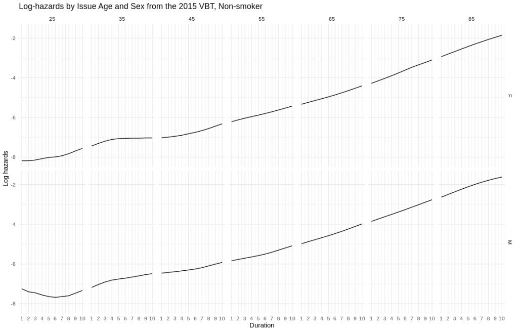
I’ve plotted some approximate log hazard curves for males and females at different issues ages. The x-axis is policy duration, the y-axis is log hazard. The top row are females, the bottom row are males. Across are the issue ages 25 through 85 by tens.
- Early duration shapes can vary for several reasons. Young males are a menace, as any personal auto actuary will tell you. Plus claims contestability in the first two durations can suppress mortality.
- Later on, there is some steepening in the mortality (aka, accelerating failures). This can be driven by a lot of things which are not easily dealt with in insurance data.
This means that out-of-the-box applications of Cox models won’t be accurate. An analyst will need to work on getting the baseline hazards right. In insurance mortality, it would be a lot of work. Plus, Cox models can have difficulty dealing with accelerating failures out-of-the-box as well.
All of this goes away if you rely on the Whitehead paper and do what actuaries have been doing for years. The price, though, is tons of data where the “deaths” column has zeros. But you get to use Poisson models, which nowadays are common enough that most actuaries can use and defend them without a lot of friction.
So now, actuaries and statisticians/data science can reconcile on the modeling approach.
To pad or not to pad
Antoni and Vivian talked about exposure padding and how this has prompted some debate.

Padding the exposures for terminations has been endorsed by the Society of Actuaries in their paper on experience study calculations. It indeed addresses the “mortality rates greater than 1” problem and is theoretically accurate.
However, there is no free lunch. Fixing the mortality rates creates new issues:
- If I subdivide my exposures by both policy year and calendar year, do I pile all the exposures into the current year? If I split the full exposure across calendar years and then summarize my analysis by calendar year, I will once again have a partial year of exposure in the current year and an extra bit of unneeded exposure in the subsequent year. This will distort the analysis. If I pile it all into the current year, my true risk exposure will be slightly overstated. For lapses, it can be substantially overstated.
- Regardless of calendar year issues, my exposures are now overstated. This is potentially meaningful at older ages or where lapses are high.
Now for my opinion, which is
Don’t pad the exposures. Ever.
I can sense a lot of pearl clutching.
Using exact exposures has a lot of virtues. There is never more exposure than there actually is. It is compatible with pivoting analytics (like pivot tables and OLAP systems). The statistical models can now accurately model phenomena without the distortion of padded exposures.
“But wait,” you may be thinking, as you sharpen the long knives to put the author out of your misery, “what about mortality rates greater than 1?”
The ratio of deaths to exposures is a hazard rate, and when aggregated a cumulative hazard. More accurately a central rate of mortality. There is a formula which converts it to a mortality rate.
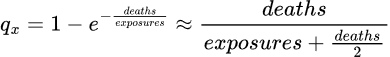
As it happens, the formula yields very nearly the same value as the approximation of adding half the terminations to the exposure in the denominator of the rate calculation (in the single decrement case).
Pipelines and Engineering
Something neither the actuary not the statistician are good at is the data engineering pipeline.

Antoni was bemoaning the woes of working with experience data engineering. It really is a chore.
Suppose he were working for a very large company with many millions of policies going back many years. If the experience study window is 10 years wide and the calendar dimension is yearly, then in the worst case, each policy will contribute 19 records. Throw in lapsation, and it may be closer to 10-15 on average. Now you have tens of millions of exposure records. Quarterly or monthly resolution balloons the storage need that much more.
Actuaries often do not know how to normalize database tables. I have seen many implementations where the facts at issue, like issue date, issue age, and gender, are replicated onto each exposure record. This itself increases the study size immensely.
I will expand on how to efficiently design an experience study in another post.
Models
Actuaries and statisticians/data scientists would approach the mortality modeling problem differently, although there is no reason to do so. I didn’t say how Antoni would model anything, but the typical pattern is still to do them by hand in Excel.

Actuaries have traditionally made factors by hand. It works well enough, but it is cumbersome and prone to mistakes. I wrote a paper on that very topic a few years ago and suggested a hybrid method for actuaries to better exploit their data.
Methods evolve, and more than a few actuaries now deploy GLMs, Cox models, and tree models and their variants to model their data. They all have their plusses and minuses. Deep learning has trouble with tabular data, and I have seen few applications of deep learning to mortality itself. All of this is largely indistinguishable from what a data scientist would do. In fact, the distinction “actuarial data scientist” may fall by the wayside sooner than later.
I can expand on that in another post. Here is a summary for the impatient.
- You can do it old school with hand-made factors. Good for you, but the approach is tedious and error-prone, and if changes have to be made, you will be doing a lot of work, again. And again.
- GLMs are explainable and now sufficiently well-known. There are many variants, including GAMs for smooth credible curves and surfaces, elastic net for credible factors, and random effects for another approach to credibility. Clearly credibility is important. And it’s all Bayesian or Buhlmann credibility. Old-school limited fluctuation credibility isn’t welcome here.
- GLM trees are useful, as they attempt to learn an optimal partition of the data with separate models in each partition. This can be important in large datasets, as a single monolithic GLM may not be able to capture underlying variation well. They are not difficult to explain.
- Boosting approaches are gaining traction, but they suffer from poor explainability. They are better suited for underwriting risk scoring than actuarial mortality modeling, which needs assumptions for projections.
Reporting
All that work is for nothing if you can’t publish it to others quickly and effectively.

Part of the data engineering is the reporting endpoints. Email? Dashboards? Maybe a fax if you’re feeling retro? This will be highly dependent on context, as some people and organizations will prefer to consume their information in different ways.
I may or may not cover this. Regardless of how important it is, I find it a bit dull.
What’s Next
I hope to cover a few topics.
Design
This will be an overview of how to design a study along with code for those who might care. This one may be done in Dataiku or KNIME to see how well they handle this situation. As of this writing, I have low hopes that they can handle it well.
This may or may not include reporting.
Cooking Up Data
I could find no publicly available datasets, so I cooked up my own! It has a few pathologies in it that I have seen through the years, like slope problems, adverse trends, and shifting risk prevalence. You should never need to create data out of thin air, unless of course you are James Woods in The Billion Dollar Bubble. However, there are some useful techniques here that the modeling nerd may enjoy.
Analysis and Modeling
I will try to keep this one light and try to hit highlights only.
Parting Words
I hope you have enjoyed this! Please let me know what you think.

Leave a comment